StrideNote tests AI tools on its own hardware and publishes what it finds. It had to look like a laboratory notebook, not a technology blog: plain, exact, and the same on every page.
The identity
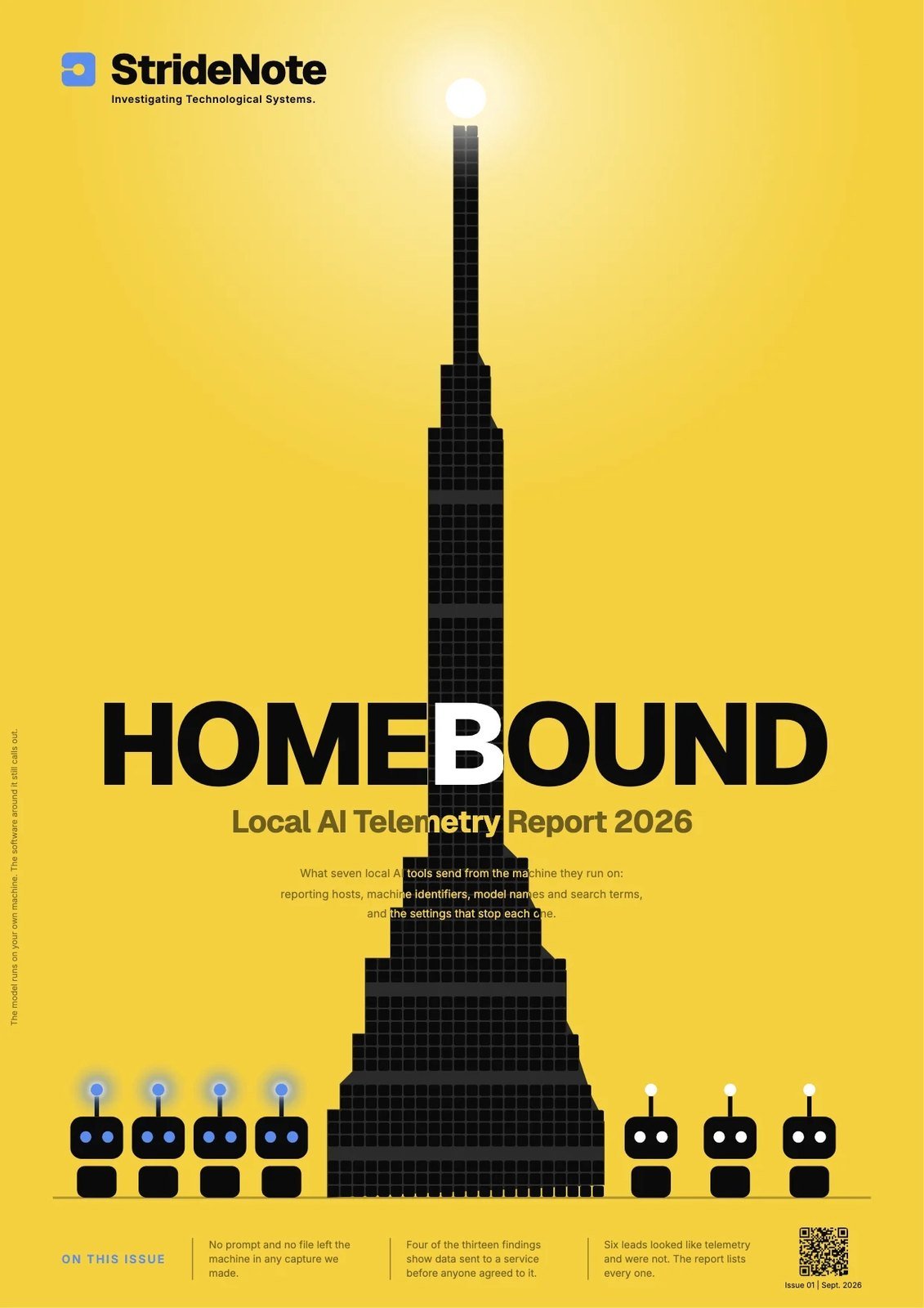
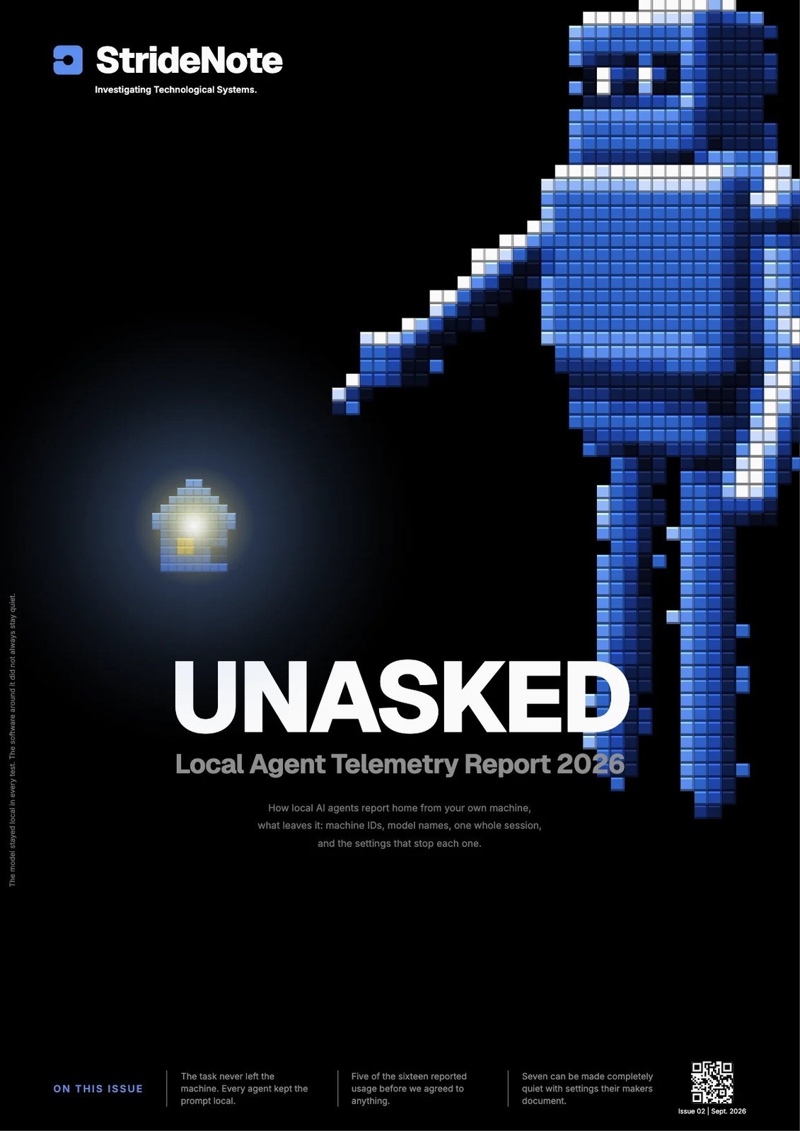
Five colours, locked, with no sixth: black, white, mist grey, a soft yellow and a soft blue. Yellow appears only as a highlight behind black type. The two accents never touch. Geist for display, Inter for text, and a 36 pixel grid under every card so the pictures and the type share one rhythm.


What it runs on
I directed the build of a custom WordPress theme and an SEO plugin to the guide, so every article, card, chart and report cover is drawn from the same rules.
Where it is
By October 2026 StrideNote had published 168 pieces and two research reports with datasets released under CC BY 4.0.