A designer’s own identity is the one job with no client to hide behind. I wanted something I could draw on a napkin and still recognise at the size of a favicon.
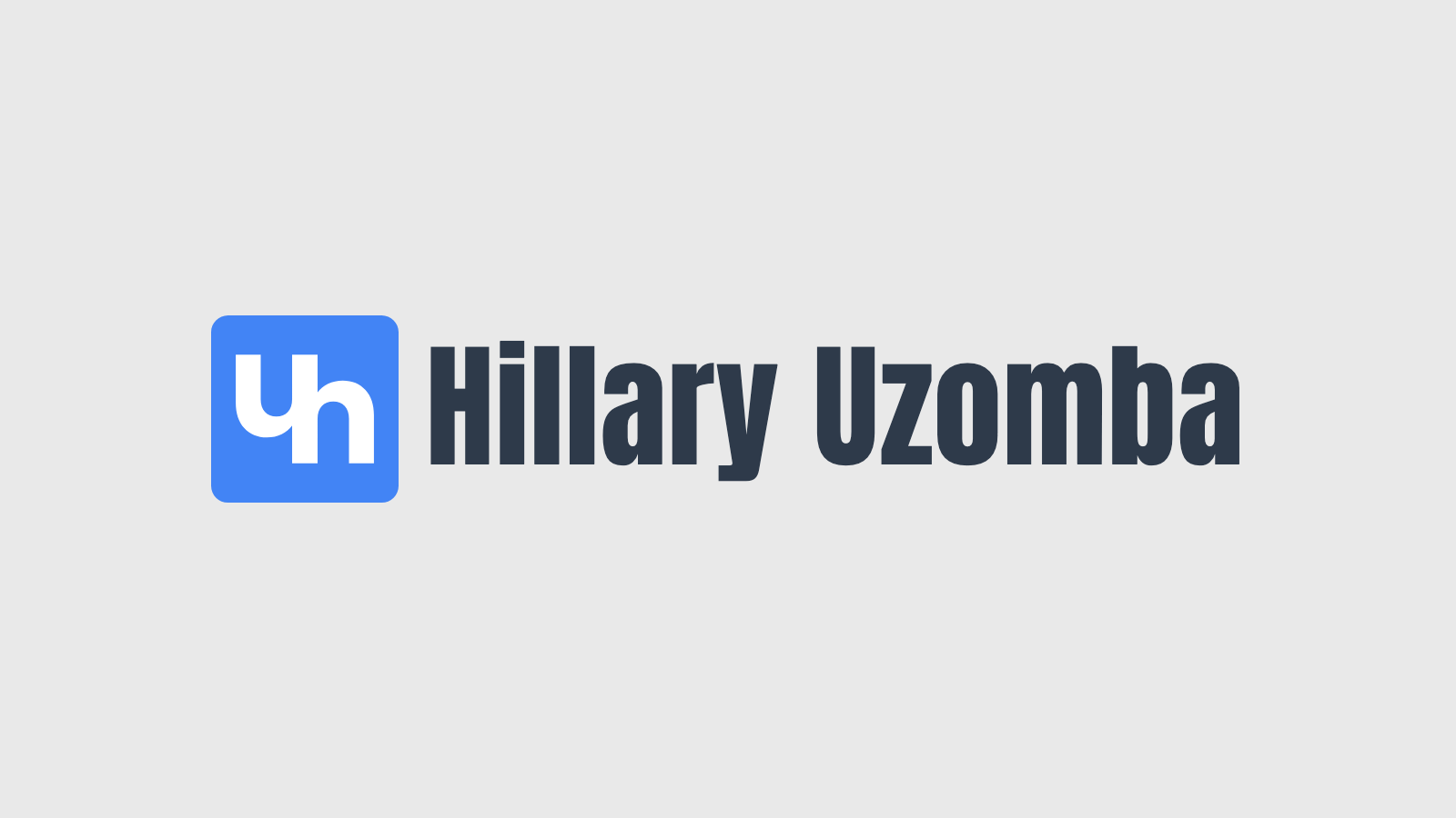
The mark
A blue square with my initials cut out of it, so the letters are made of whatever sits behind. It keeps its blue on every ground.

The type and the colours
Anton for the thick headlines. Antonio, its lighter family, for sub-headings and the thin accent inside a headline. Geist for text. Blue, black and gold, with a dark slate for headings and a softer slate for reading. This site is the first thing built from it.